Kwivuza ePrescription: from patient visit to medical voucher
Designing the clinical and pharmacy flow that turns a patient visit into a verified medical voucher for Rwanda's national health insurance schemes (RAMA and CBHI).
Context
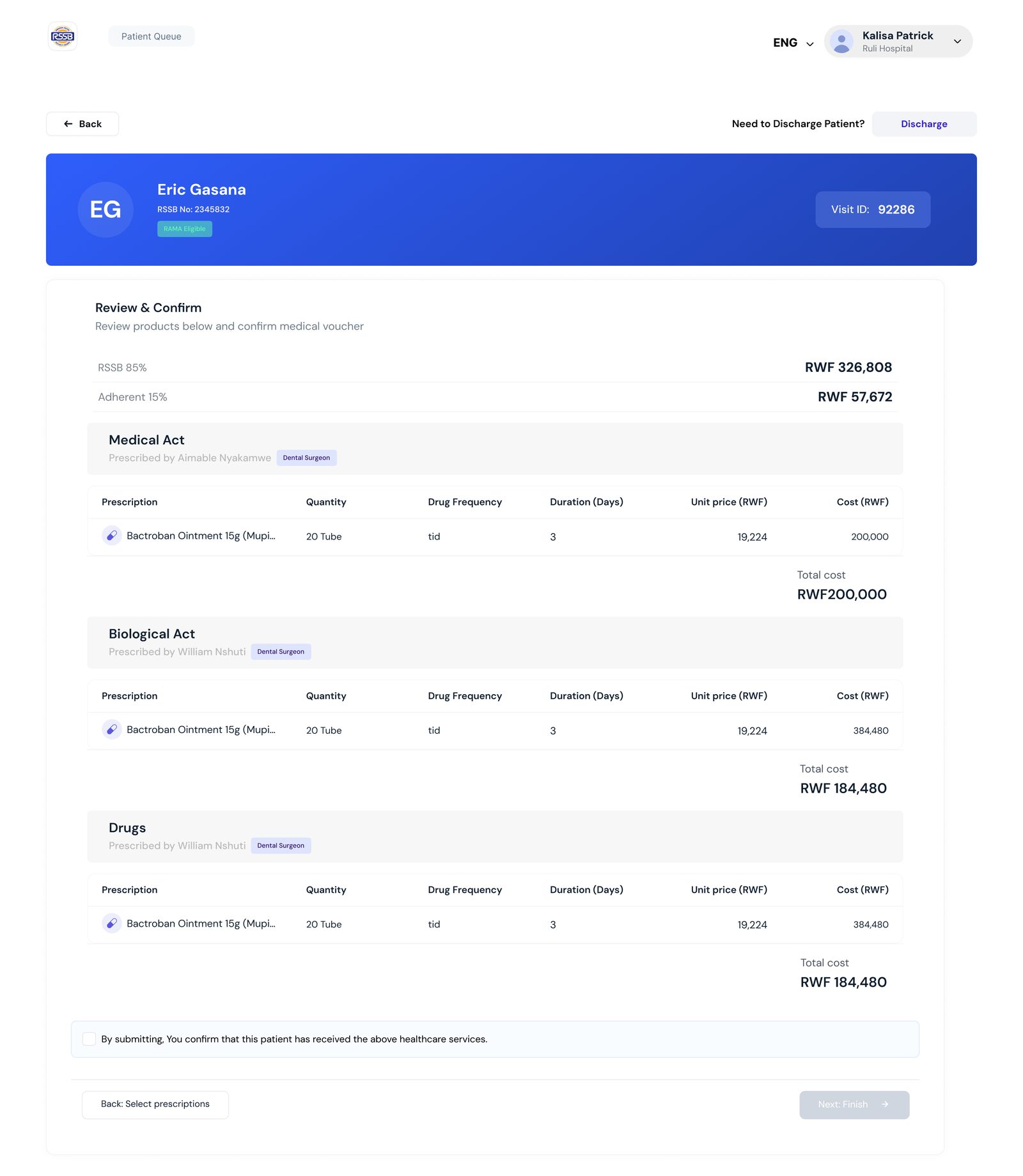
Kwivuza digitises the RAMA and CBHI health insurance schemes. At a health facility, one patient visit touches many people: the front desk, the doctor, a medical advisor who may need to approve, hospital staff who dispense, a pharmacist, and later a verifier who decides whether the claim is valid. The medical voucher is the record that ties all of it together.
Field research
I started by looking at how vouchers were actually verified, in the offices where the work happens. The visit photos below shaped the brief: verifiers needed one complete picture of a visit, not scattered documents.
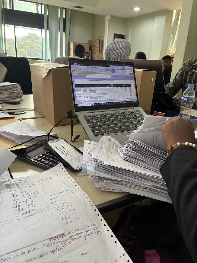
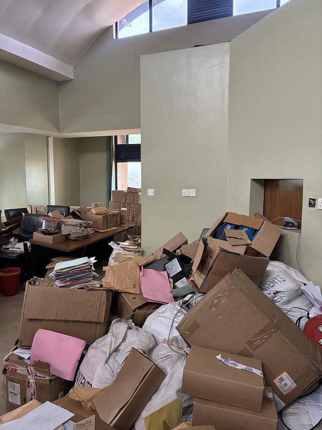
Field visit photos: how vouchers were verified.
The problem
The flow had to work for several roles at once while keeping one source of truth. Questions we had to answer: who creates the visit and when? Which items need medical advisor approval, and what happens to a prescription if a drug changes after review? Can a visit have several vouchers? How does a pharmacist dispense without re-typing what the doctor already recorded?
Process: mapping the journey
I mapped the end-to-end journey before drawing screens: patient arrival and eligibility check (NID or RAMA number), visit creation, doctor recording acts, lab tests and prescriptions, the clinical note, the medical advisor decision, dispensing at the hospital, inpatient or discharge branches, and the pharmacy path that ends in a pharmacy voucher. The board also records decisions made with the team, for example that the clinical note is reused for documentation and for approval at verification level.

Journey flow (scroll sideways). Sticky notes capture decisions: a visit ID can hold multiple vouchers; pharmacists no longer re-enter drug information; verifiers see a holistic view of the visit.
The solution
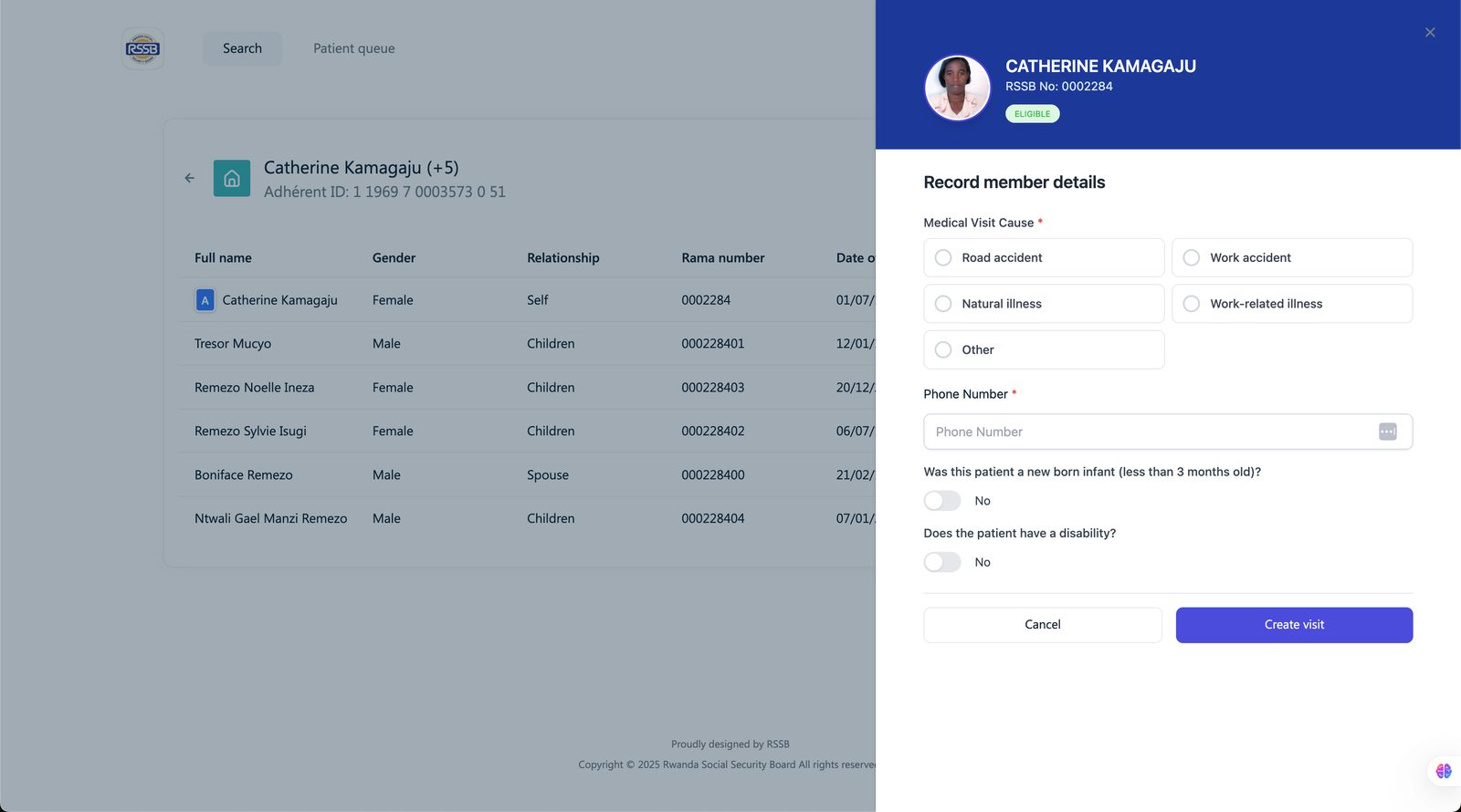
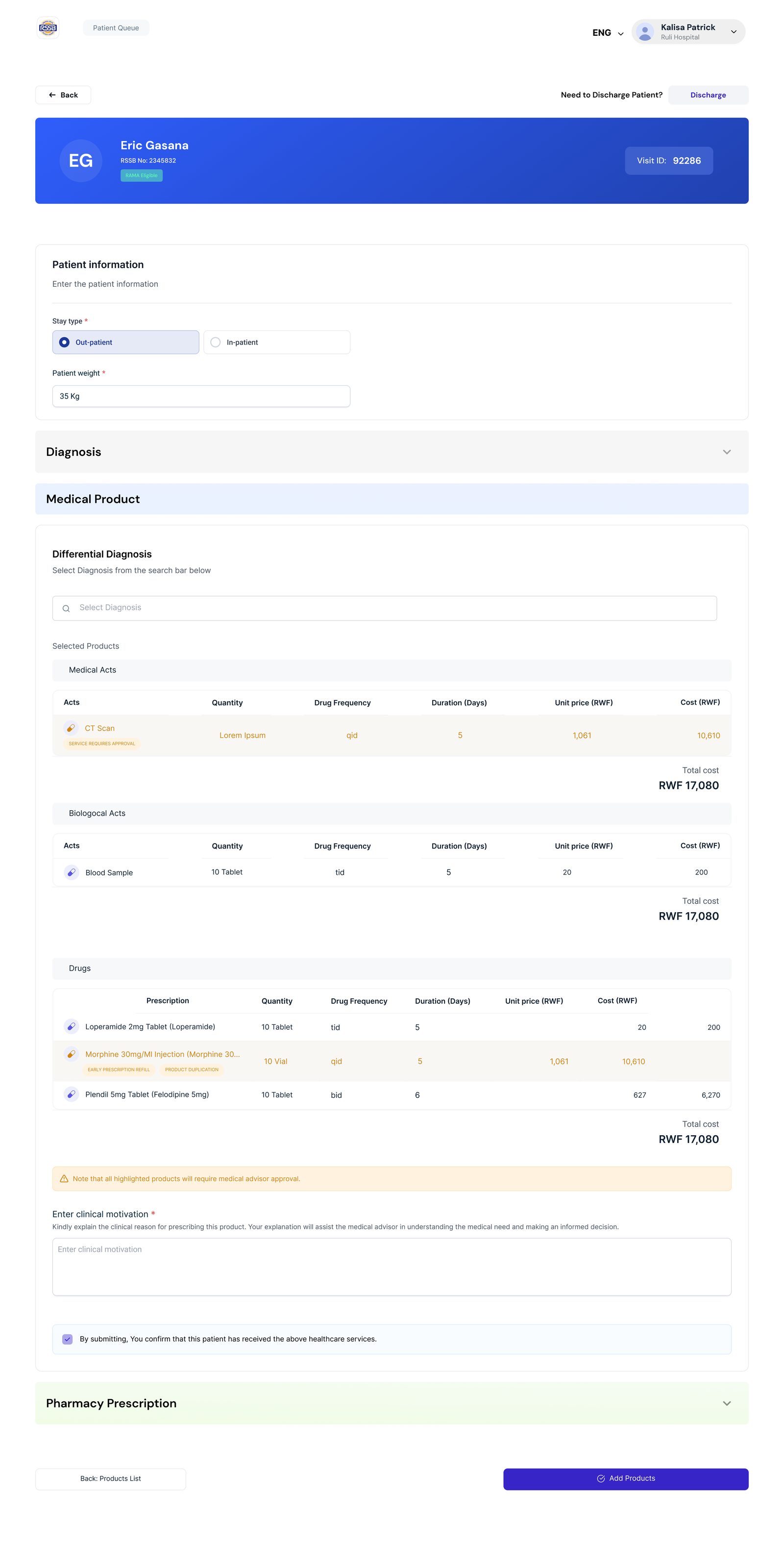
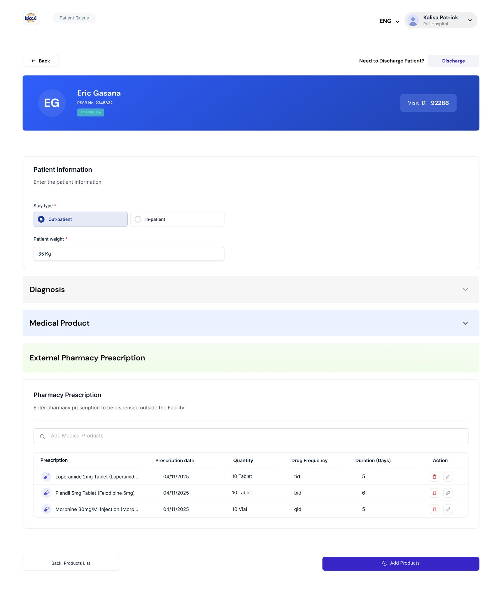
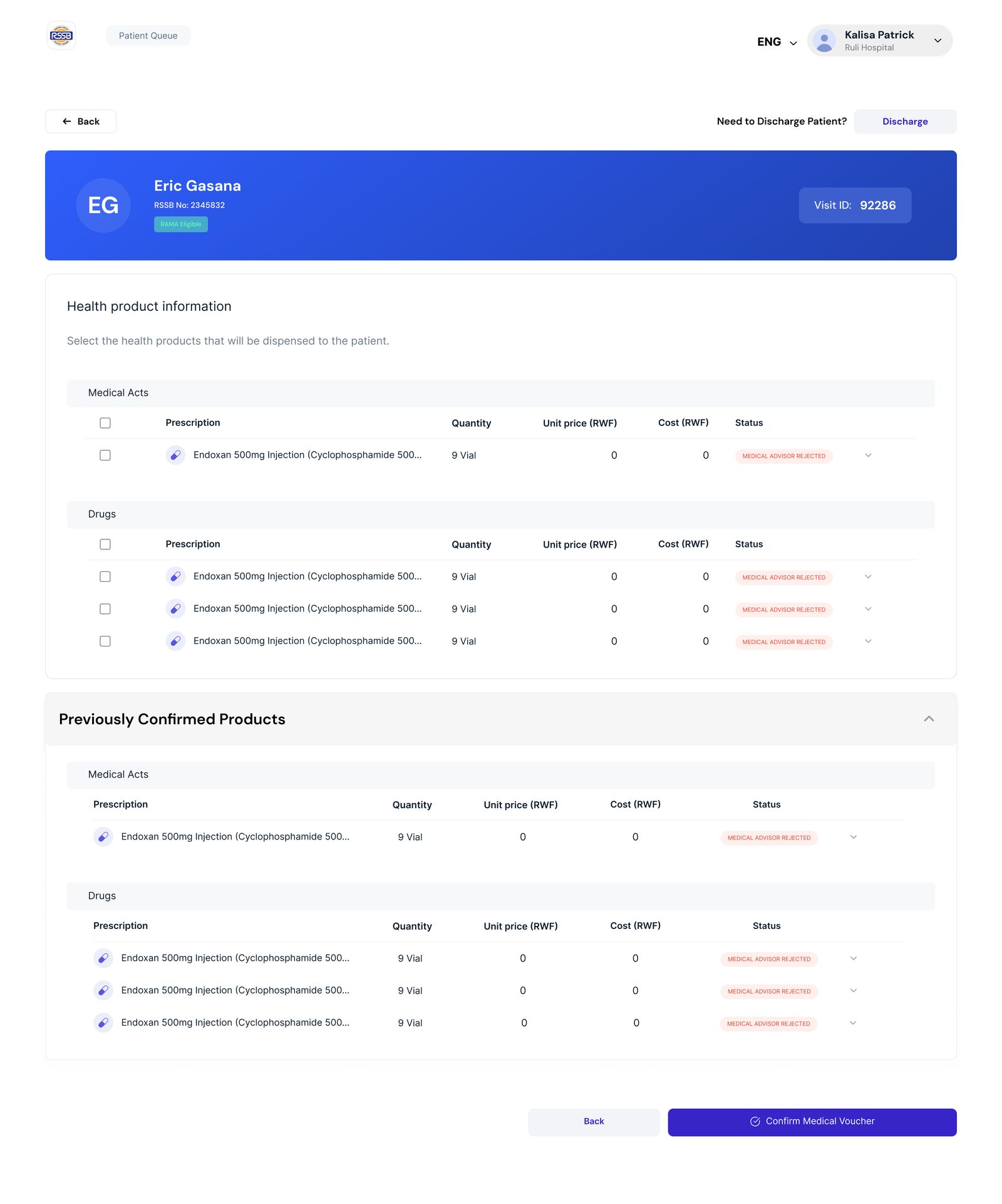
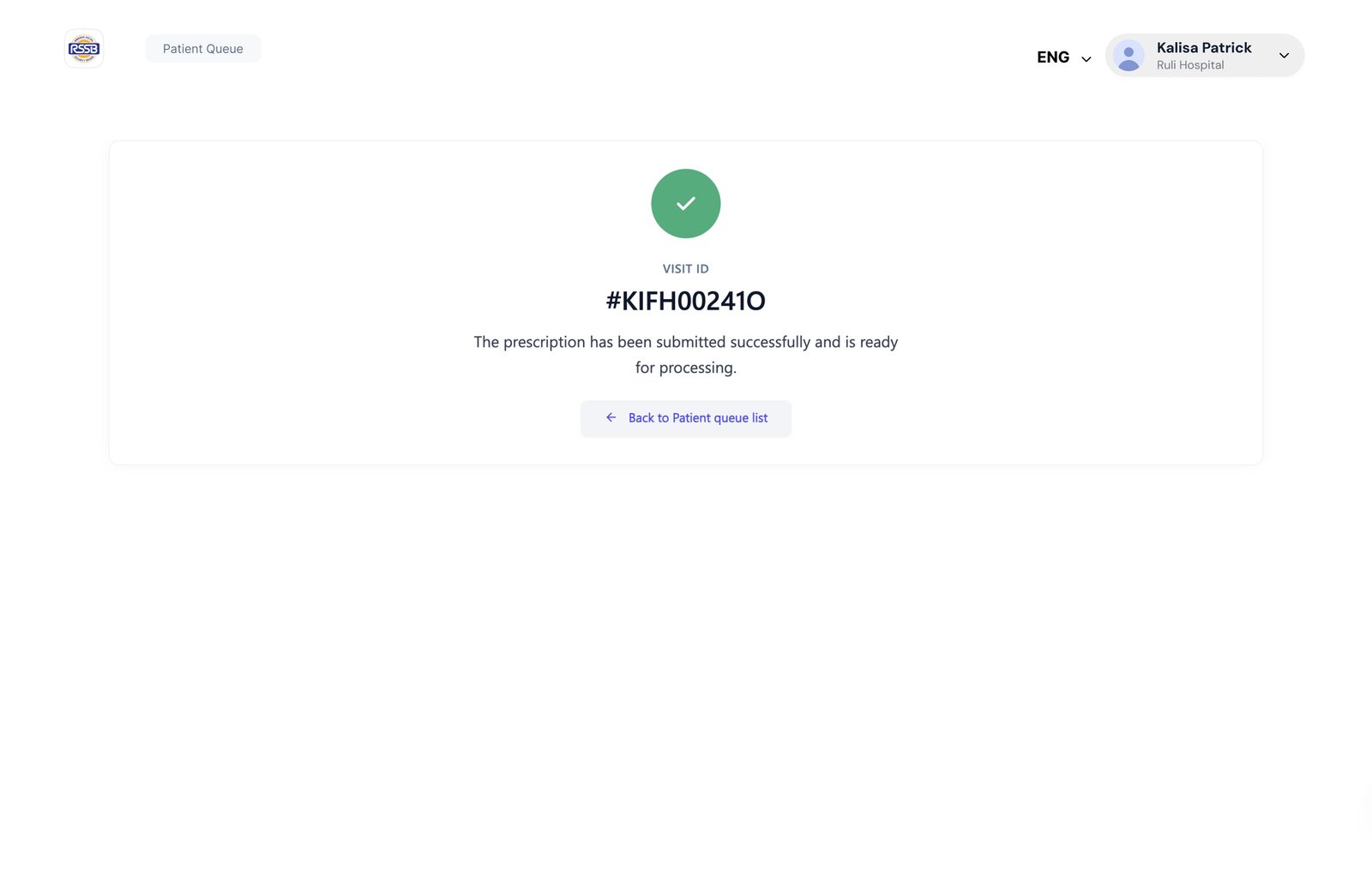
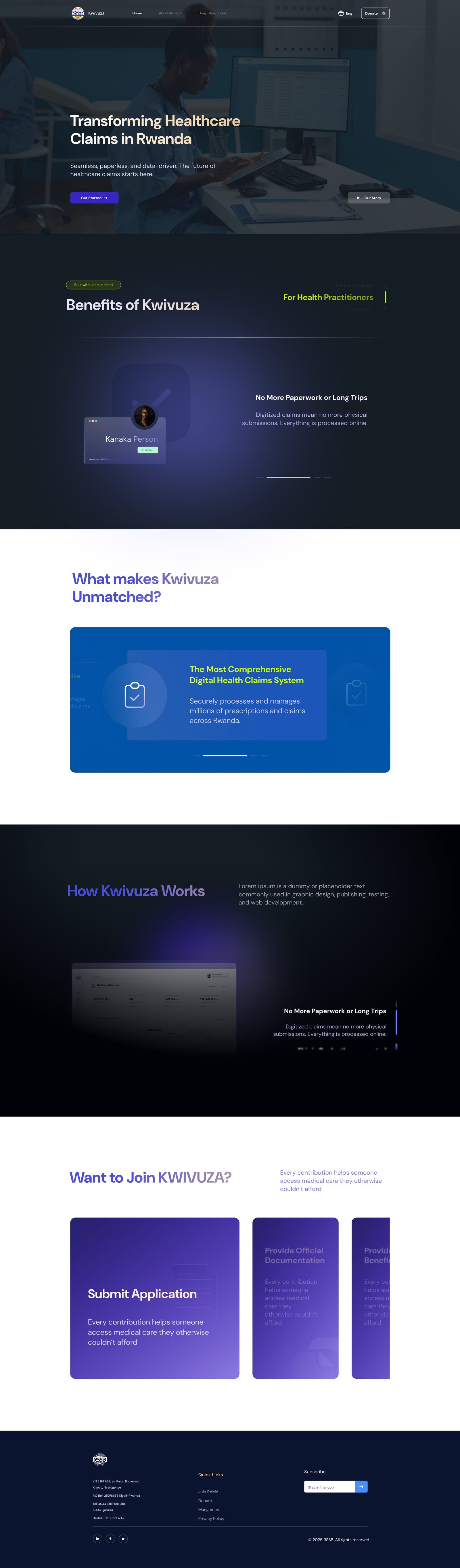
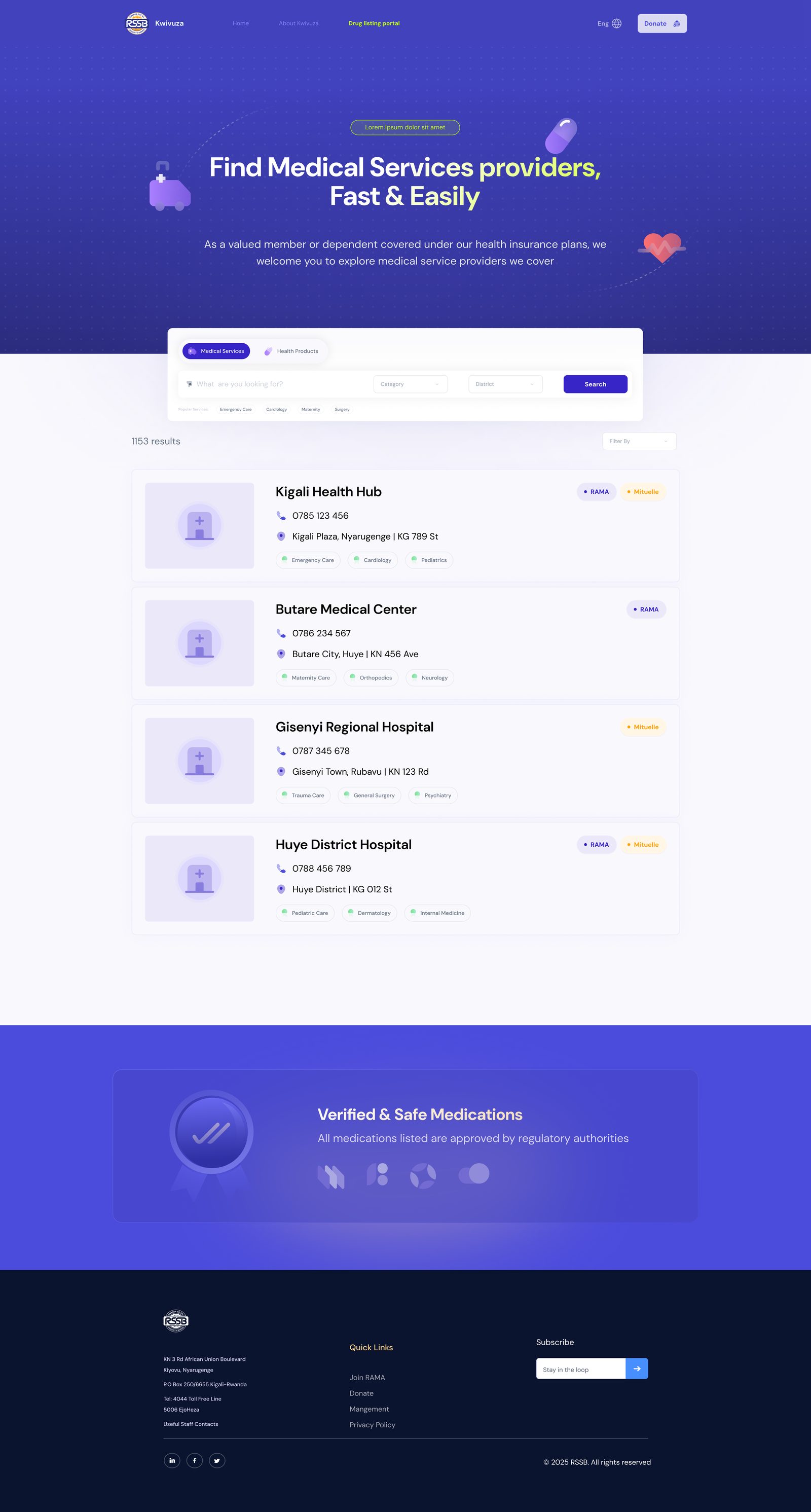
Also on Kwivuza: public website
I also designed the public Kwivuza website: a claims-focused landing page, a giving page and a provider finder where members can search for medical service providers.
Outcome and what I learned
The journey map, the field research and the screens gave the product team and developers one shared reference for how a visit becomes a voucher. The main lesson: in multi-role workflows, the hardest design work is deciding who enters what, once. Everything else, from layout to status labels, follows from that.
Next step I would take: usability-test the doctor and pharmacist steps in a facility and track time to confirm a voucher and corrections after submission.