Umucyo V2: the public face of national e-procurement
Redesigning the public portal where suppliers and citizens find tenders, check deadlines and costs, read documents, follow plans and awards, and see who is barred from bidding.
Context
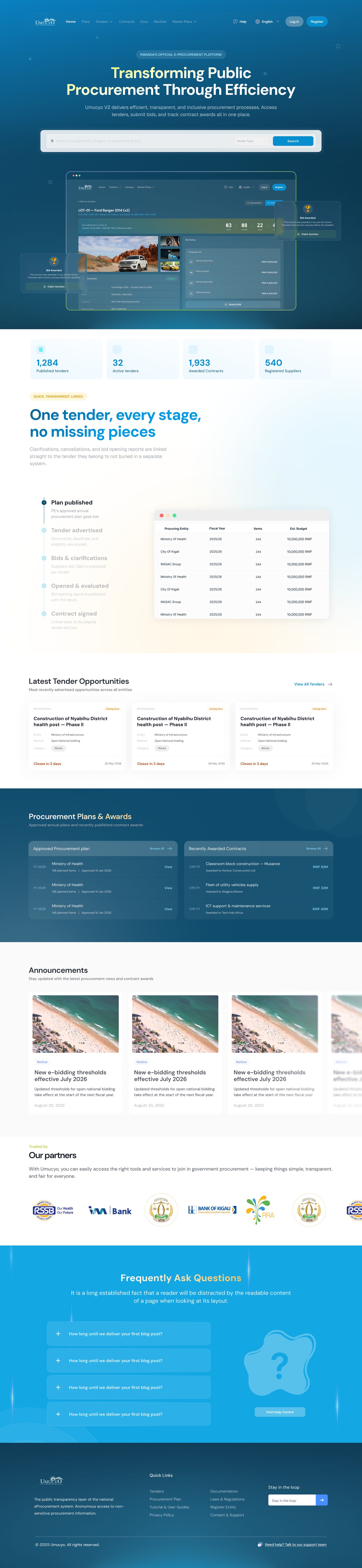
Umucyo is Rwanda's national e-procurement system. Its public side has a simple job with serious consequences: if a supplier misses a deadline, misreads a bid security amount or cannot find a document, a qualified bidder drops out. V2 is a redesign of that public experience, delivered as a consultant.
The problem
Tender information is dense and time-critical. Suppliers must scan many tenders quickly, then find the few facts that decide whether they can bid: closing date, method, bid security, tender fee, site visit and opening date. Transparency pages (plans, awards, blacklist) must be easy to search and trustworthy. The earlier prototype also had gaps against the business requirements.
Process
The solution
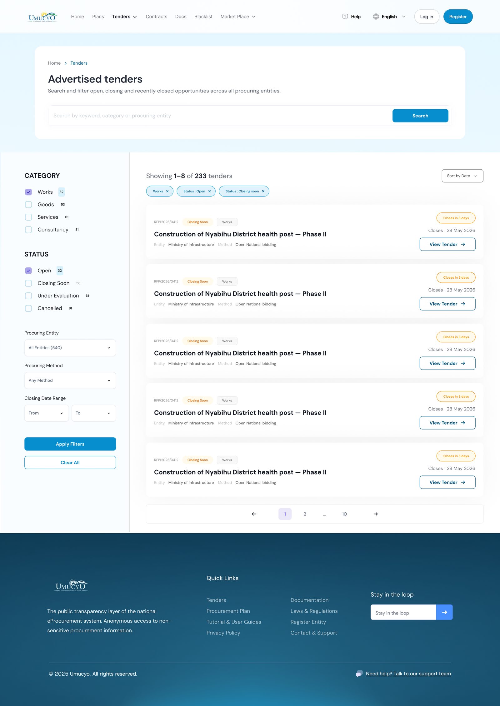
- Scannable tender cards. Reference, “Closing soon” status and category on one line; entity and method next; deadline and call to action grouped on the right.
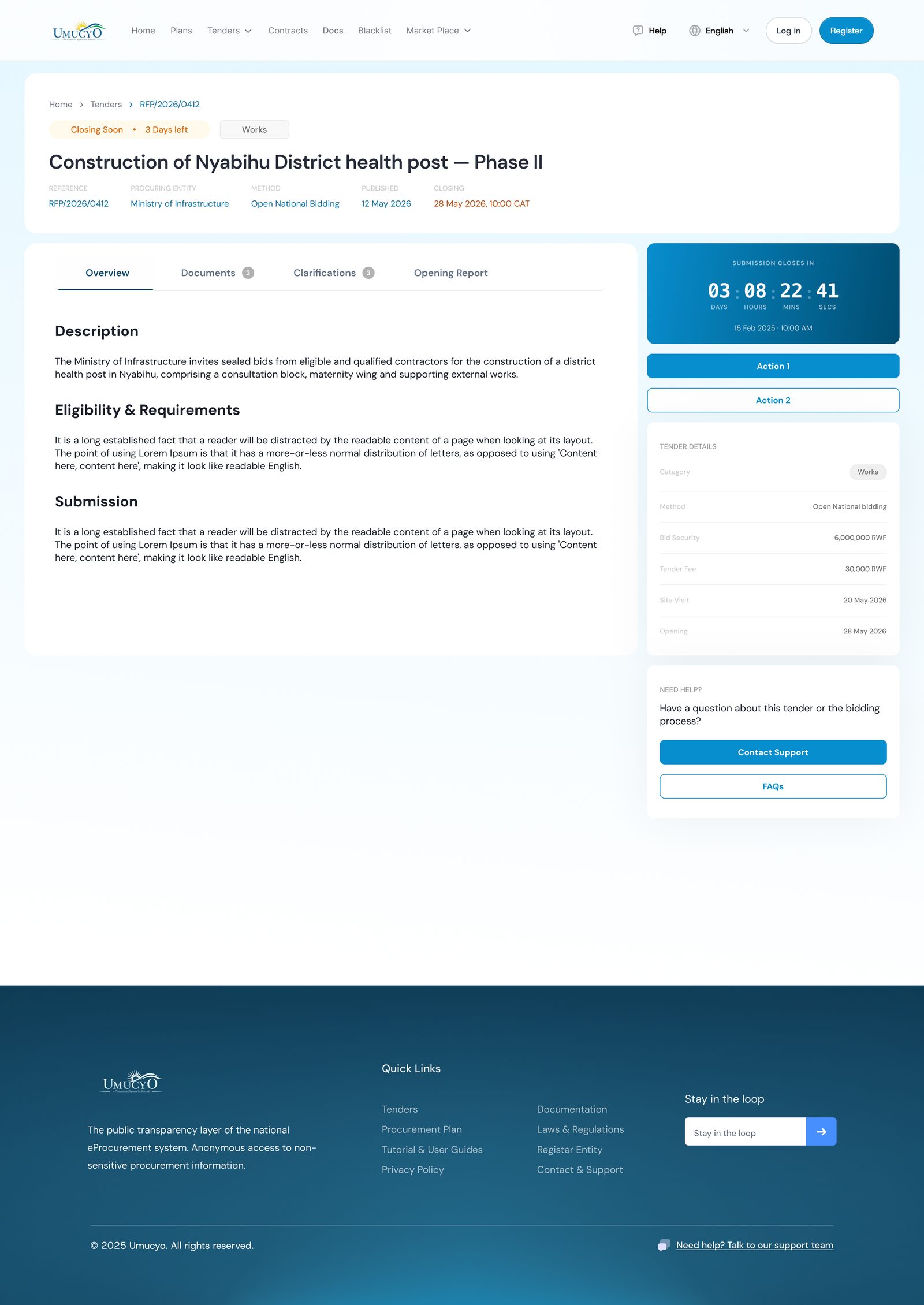
- Urgency you can read. Relative time (“Closes in 3 days”) plus the exact date, and a live countdown on the tender page.
- Filters that match how suppliers search. Category and status with counts, active filter pills, procuring entity and method, and pagination.
- Decision facts in one place. Category, method, bid security, tender fee, site visit and opening date in a fixed side panel.
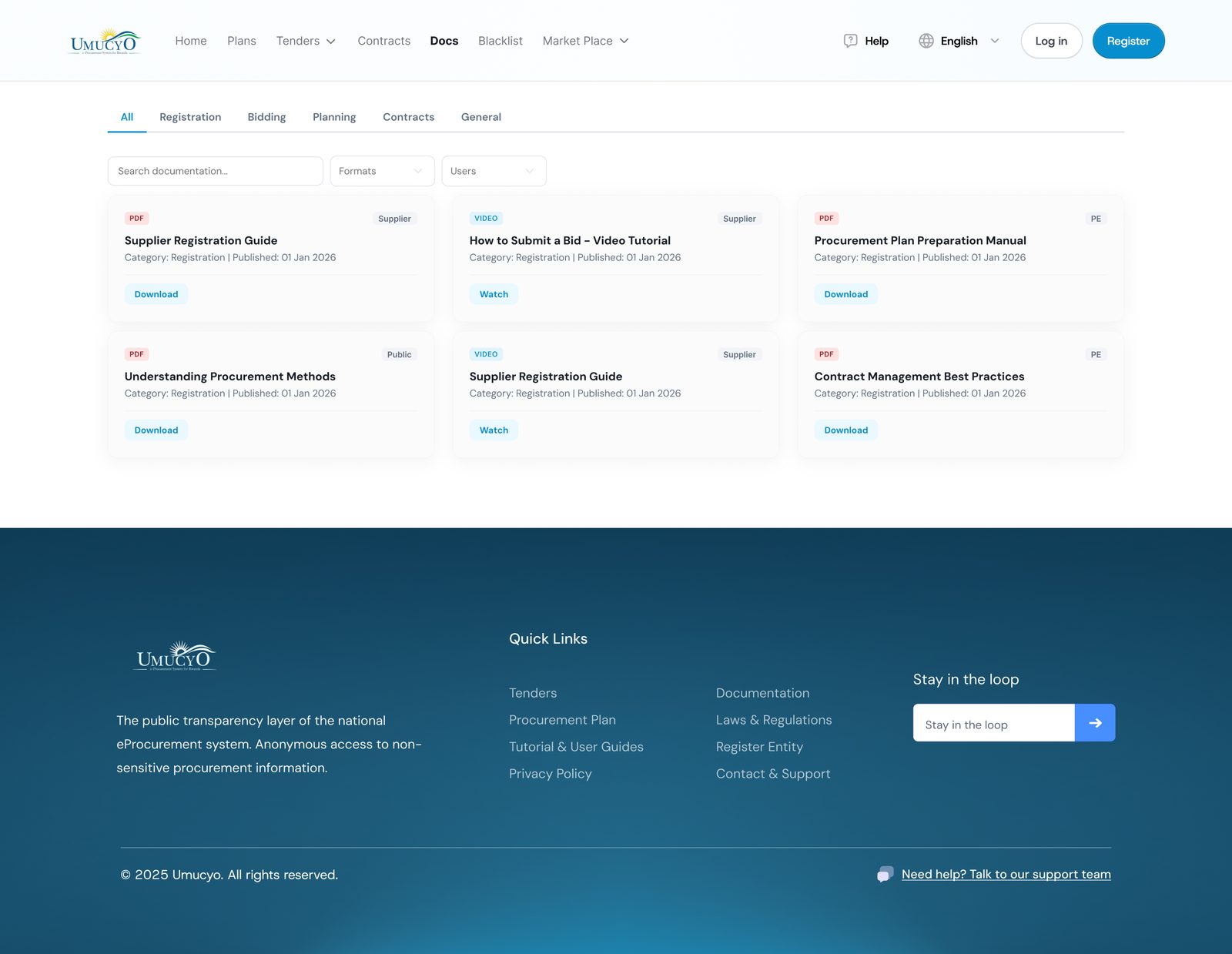
- Documents you can trust. File type and size visible before download; the documents area covers PDF, image, audio and video, as the requirements ask.
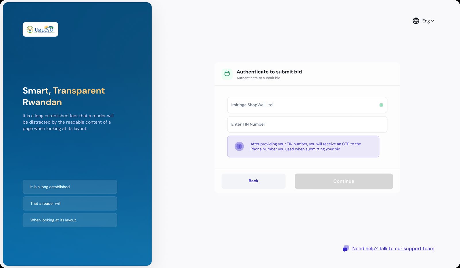
- Authentication for bid submission. A short, guided step: company, TIN, then an OTP to the registered phone.
Transparency pages
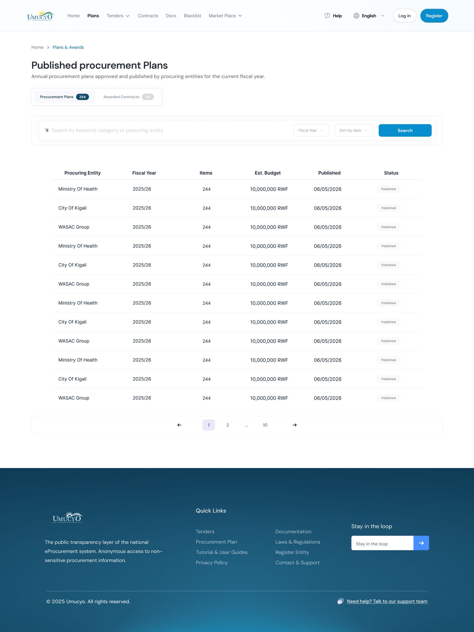
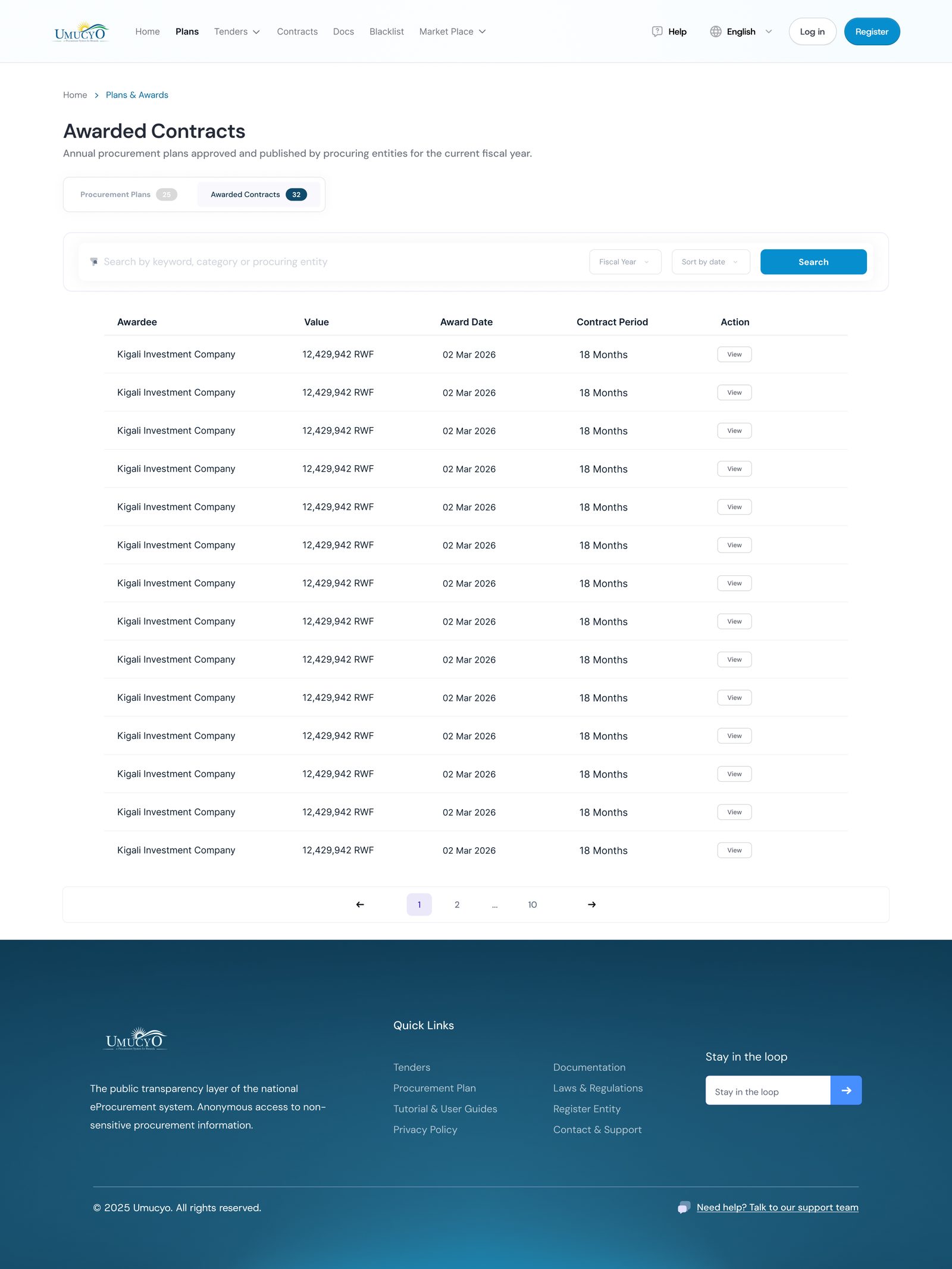
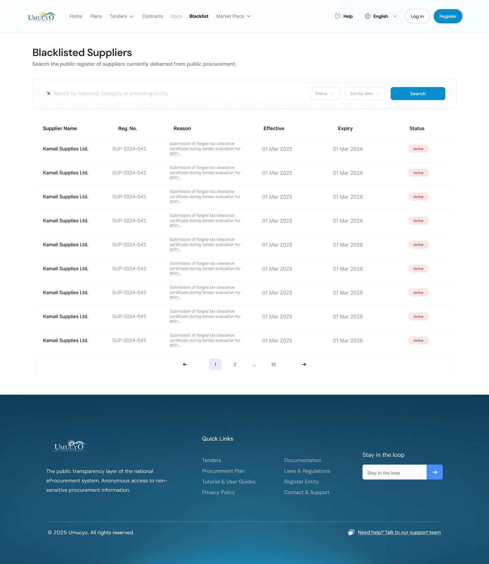
Plans, awards and the blacklist share one table pattern, so a citizen who learns one page can read the others: clear columns, search, filters, status chips and pagination.
Public asset disposal
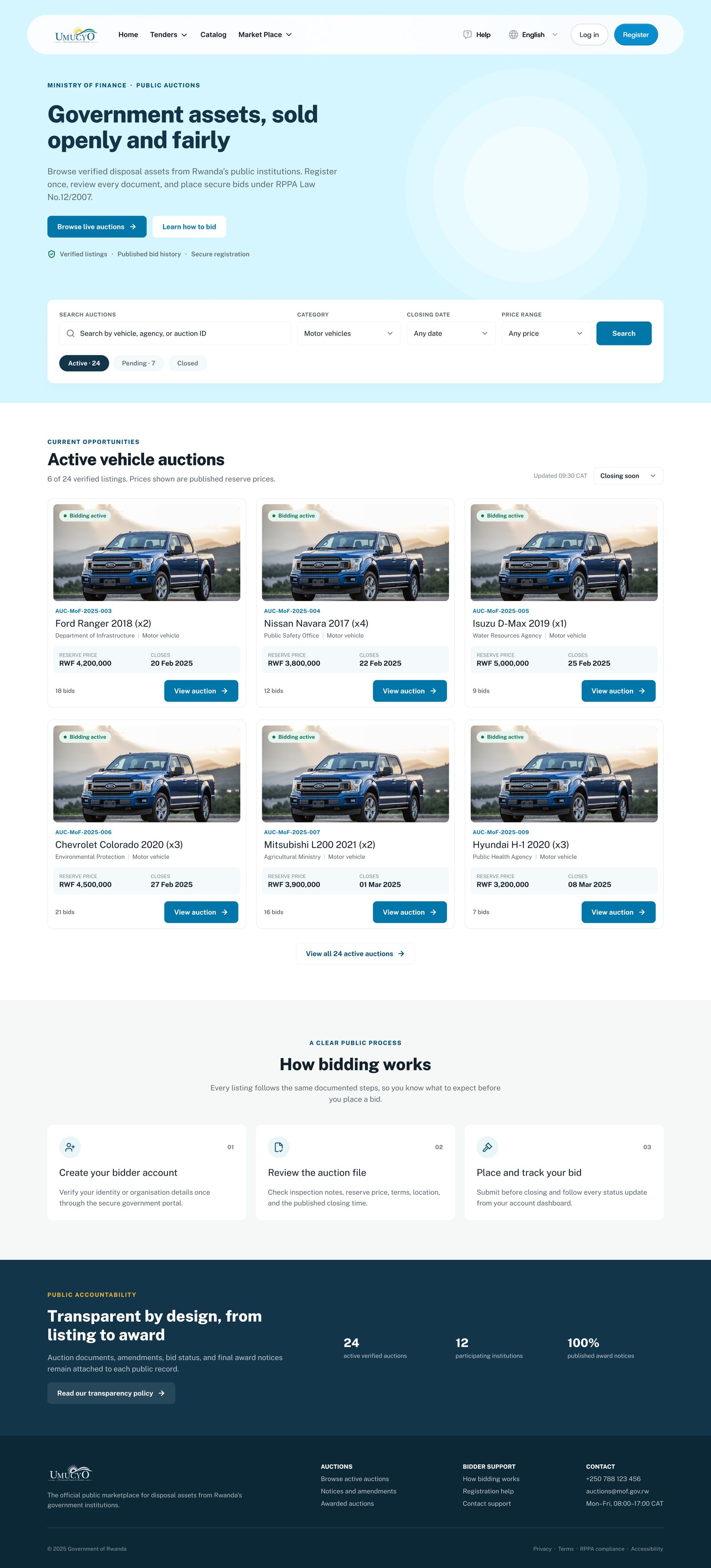
I also designed the landing page for public asset disposal: browse verified listings, filter by category, closing date and price, and see active auctions with clear bid status.
Outcome and what I learned
The result is a consistent set of public-portal screens mapped to the requirements, with one component system across tenders, plans, awards, documents and disposal. In procurement, clarity about time and money is the product, so every pattern was chosen to make a deadline or a cost impossible to miss.
Next step I would take: test the tender-to-bid journey with real suppliers, including on low-bandwidth mobile connections.